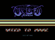
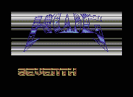
I think I started to draw logos in 1988. In those times without the use of illegal opcodes the only way to move or scroll a logo horizontally (or to dynamically change its colors for that matter) was to make it a character art instead of a bitmap and relocate it on the fly. There were some lame logo editors to create logos 32 characters wide and eight characters high. I wanted more space and coded a logo compactor, which created logos that used up characters only for non-empty sections of the logo. It was a new idea.
Big Logo Disk is a bundle of my first ten logos presented via small demos coded by the members of High Woltage. I made logos mainly for self-purposes but there're some created for other groups of the Hungarian scene.
During this "first period" of my logo drawing career I started to use the title The Logo King, which is a bit impudent, but those logos made some difference those days (even if it's hard to believe). I'm sure, logos from the 90's those are far more sophisticated and have better design.
If you have the stomach to read the scroll texts, you get the picture of a 15-year old boy's thoughts about life.
- Part 0, Part 1. The menu and the first two parts are quite simple, there're no stunning effects in the code. In the menu I show my first 3x3 character-set. In the Big Logo Disk we re-cycled some 3rd party graphics (mainly char-sets) and music. Of course no code ripping was done.
- Part 2. This part is also quite simple (though the multi-speed scroll is a nice one). Arny was a classmate of mine in the secondary school, he was also part of the scene, with foreign contacts. For some reason I started to hate him like hell and it took more than a year to consolidate the situation.
- Part 3. Again, My first 3x3 char-set, maybe my first border take-off, and a nice effect with those rotating raster bars. We used BASIC in those days only to create sinus tables :)
- Part 4. This part is my absolute favorite. This is just too good. It has a multi-speed pulsing scroll (my idea, yes), some Lissajou curves. That bottom effect with the logo is quite something (remember: we're in 1989). And the tunes match the ambient of the whole part.
- Part 5. Teonaki's part. I don't really like this part, takes too much time to get to the final effect.
- Part 6. A nice one. My first side-border take-off. Tape cassette player scroll, a master idea. A char-set designed by me, split raster bars. That's all.
- Part 7. Nothing special.
- Part 8. Previously it was the intro for the Logo Editor System, with a 2x2 SCC char-set. That bar around the (multi-speed) scroll is a nice one.
- Part 9. My other favorite. This is a cool and really composed part. The convex lens effect is working well. I haven't seen a similar effect on the 64 ever since. Keep your eyes on the raster bars at the bottom... The scroll text is worth reading, it tells the story of the High Woltage and closes a chapter of my life.
Download
- Big Logo Disk: This release contains the Big Logo Disk, the Logo Editor System, and notes. (174 848 bytes)
All screen shots presented here contain the whole screen area (or even more), the borders are always included. Of course there're some border take-offs... Captured using CCS64 and its Use PAL Palette mode.


0 comments:
Post a Comment